
The American Icon project was very interesting to do. I learned different things throughout
the project, mainly centered around the three icons that I had originally picked. These icons were The National Breast Cancer Foundation, CERN, and Tony Sorensen. Each of these
people to me were iconic. The National Breast Cancer Foundation has helped men and women for 18 years now. By providing free mammograms to those who can not afford them as well as spreading the knowledge about breast cancer. CERN itself has been the leading organizations
for the research of high energy physics, with each new find they have furthered our scientific development. Lastly but not least Tonny Soeresen has created several new marketing styles and management styles since taking over the company Von Dutch. Each of these icons has taught me to work hard for what I believe in because in the end it will pay off.
During this project our Artist Statement went through several different drafts. The first being our rough draft. Once we had finished writing it one of our peers then critiqued it. This was helpful to me because the peer who critiqued mine was able to find a lot of the grammar mistakes that I had not noticed, as well as many of the spelling mistakes. After our second draft was completed we then had two of our peers critique our paper. During his my peers were able to let me know which sentences might have sounded weird or just anything I might have needed to fix. After all that revising our final copy was done.
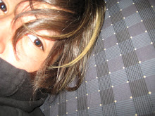
At the end of this project I am proud, happy, and a little weary. I am proud because I feel I have accomplished everything I wanted to through my picture as well as my artist statement. I am happy because it is done and all my hard work has payed off. But I am also weary because the icon I chose (NBCF) is a widely known foundation and I want my project to do them justice. My picture is probably the most different one of them all and I hope that it does not offend anyone but instead brings awareness and hope.
the project, mainly centered around the three icons that I had originally picked. These icons were The National Breast Cancer Foundation, CERN, and Tony Sorensen. Each of these
people to me were iconic. The National Breast Cancer Foundation has helped men and women for 18 years now. By providing free mammograms to those who can not afford them as well as spreading the knowledge about breast cancer. CERN itself has been the leading organizations
for the research of high energy physics, with each new find they have furthered our scientific development. Lastly but not least Tonny Soeresen has created several new marketing styles and management styles since taking over the company Von Dutch. Each of these icons has taught me to work hard for what I believe in because in the end it will pay off.
During this project our Artist Statement went through several different drafts. The first being our rough draft. Once we had finished writing it one of our peers then critiqued it. This was helpful to me because the peer who critiqued mine was able to find a lot of the grammar mistakes that I had not noticed, as well as many of the spelling mistakes. After our second draft was completed we then had two of our peers critique our paper. During his my peers were able to let me know which sentences might have sounded weird or just anything I might have needed to fix. After all that revising our final copy was done.
At the end of this project I am proud, happy, and a little weary. I am proud because I feel I have accomplished everything I wanted to through my picture as well as my artist statement. I am happy because it is done and all my hard work has payed off. But I am also weary because the icon I chose (NBCF) is a widely known foundation and I want my project to do them justice. My picture is probably the most different one of them all and I hope that it does not offend anyone but instead brings awareness and hope.
Beth!! i love your project I love how you made your picture your own and i thought your icon was very different, like instead of having like a person as an icon you had like a charity, and I thought that was very interesting.. Good job beth!!
ReplyDeleteI loved your project! It's really unique, and makes a bold statement. I definitely think that this does the NBCF justice. There were a few spelling mistakes, and the formatting in the first paragraph (it may just be my computer) is a little off, but other than that I think these ideas are really good. Great job!
ReplyDeleteBeth! Evrin said exactly what I was going to say haha. I thought it was really cool that you decided to have an organization as your icon and I think your picture represented them really well. Your picture was very creative and it looks really awesome :D Overall, I think your project was very well done.
ReplyDeleteYour picture is very creative and it shows a lot of what you and your icons thoughts are. I think you put a lot of time in to the photo and effort. Good job.
ReplyDelete